
LinkedIn AI Changes & The Butter Yellow Trend: What You Need To Know
There's been a few changes floating around social media the last couple of weeks. None of them are massive on their own, but a few are worth knowing about, and there are a couple of trends out there right now that people seem to be scratching their heads at. So let's get into it.
LinkedIn can now report your comments as "AI slop"
This one's just landed on Australian accounts after being live in the US for a few weeks. LinkedIn now has a proper reporting flow, not just the generic "report comment" button, but one specifically for reporting content as AI slop.
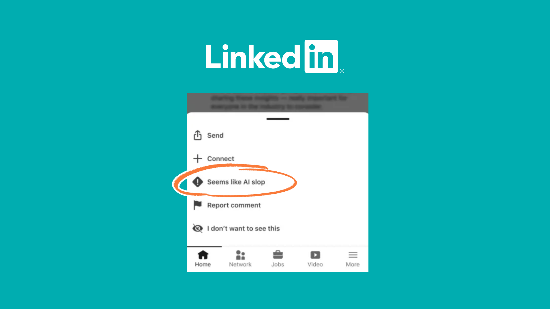
The reason this matters isn't "yay, we get to report AI content." It's that the platforms themselves have cottoned on to something: as an audience, as consumers, as the people who keep their lights on, we're sick of a lot of the AI-generated stuff being pushed at us. That's significant enough that LinkedIn built an entire reporting process around it.
Worth knowing, because almost every small business owner I know uses AI in some form. My rule of thumb: use it as assistive, not generative. I've got Claude open most days. Does it create content for me? No. Does it look at things and pick up patterns? Yeah. Do I dump a pile of notes and to-dos in there and ask what I should prioritise? Yes. Do I say "create me a graphic for a post about XYZ"? No. I still get on camera and talk it out myself.
Thinking of AI as assistive rather than generative will save you a lot of grief here.
Instagram's AI detector is currently losing the plot
Meta has rolled out some fairly harsh AI detection into Instagram (likely Facebook too), automatically flagging posts as AI-generated without you ticking any box. That flag can throttle your reach, and it shows your audience, publicly, that the post wasn't actually made by you.
I don't love this one. LinkedIn's manual reporting, I'm mostly fine with, as long as people aren't weaponising it against competitors they don't like. Instagram's automatic version is a different story, because it's currently flagging almost anything made in Canva.
A lot of people have pinned it to the background remover tool, which has been around for years but does use an AI process to find edges, so it's getting caught up. But here's the bit most people don't know: Canva's stock library, the little graphics, photos and videos you can drop into a design, is built the same way stock libraries always have been. Creators submit work and earn royalties when it's used. Since generative AI made it easy to churn out graphics, some of those creators have started uploading AI-generated work into that same library. Sometimes the file name still says "chatgpt" if you dig into the metadata. A lot of the time it doesn't.
Which means you could be using a stock element from inside Canva and have absolutely no idea it's AI-generated.
So what do you actually do? For now, lean into organic. Real photos you've taken, not heavily edited. Real videos of you talking to camera, your premises, your workflow, your desk. Your own B-roll instead of stock B-roll. Limit the editing.
Some of my best-performing posts lately have been me holding up a handwritten post-it note, or a page from my own book. One went out the day Google Drive went down and I just grabbed a pen instead and drew the Google Drive Logo and took a selfie with me looking sad with my (bad) drawing. That kind of content dodges the detectors, but it also connects better, because it's actually human. It's not that everyone hates AI, the loud ones really do, but not everyone. It's that people don't want it shoved down their throat constantly. If you're service-based, especially small business, your audience wants to know the human behind it. Flawed, imperfect, real, that's the trust builder.
If that means fewer posts because you're being more thoughtful about staying organic, that's genuinely fine. Skip the goal of three Canva graphics a week. Handwrite something and photograph it. Talk to the camera. It might take longer than knocking up a template, but it's far less likely to get flagged, and it's more likely to actually perform.
Worth a mention too: the EU passed a bill in August requiring AI-generated content to carry a watermark. Easy enough to hide in an image. Coming for text as well, based on which words get chosen and in what pattern, which is clever and not something you'd ever spot just by reading. Point is, it's time to put our brains back on. Use AI to filter ideas, then do the writing and the graphics yourself.
Funny aside: I ran a piece of text through an AI detector recently. Word-for-word transcription of something I spoke into my microphone myself, no edits, no punctuation touch-ups. Came back 99% likely AI-generated. So if you've seen good people getting reported for AI slop when it's really not, especially in the author and bookish world lately, that's worth remembering before you hit the button. Make sure you're sure.
A few fun Instagram updates
Lighter stuff now. Carousels can now be captioned per slide instead of one big caption at the bottom. It's a small dropdown in the app, single caption or multi-caption, and it's genuinely useful for storytelling across a carousel.
Instagram's also changed its wordmark logo. Doesn't affect your strategy in the slightest, but you'll have seen the chatter, so consider yourself briefed.
And if you're precious about your grid looking aesthetically consistent (useful for photographers in particular, since that grid is basically a portfolio), you can now reorder posts by dragging them into place. Select the post, hit "reorder grid," drag it where you want it. Not essential for most of us, but a nice little toy if that's your thing.

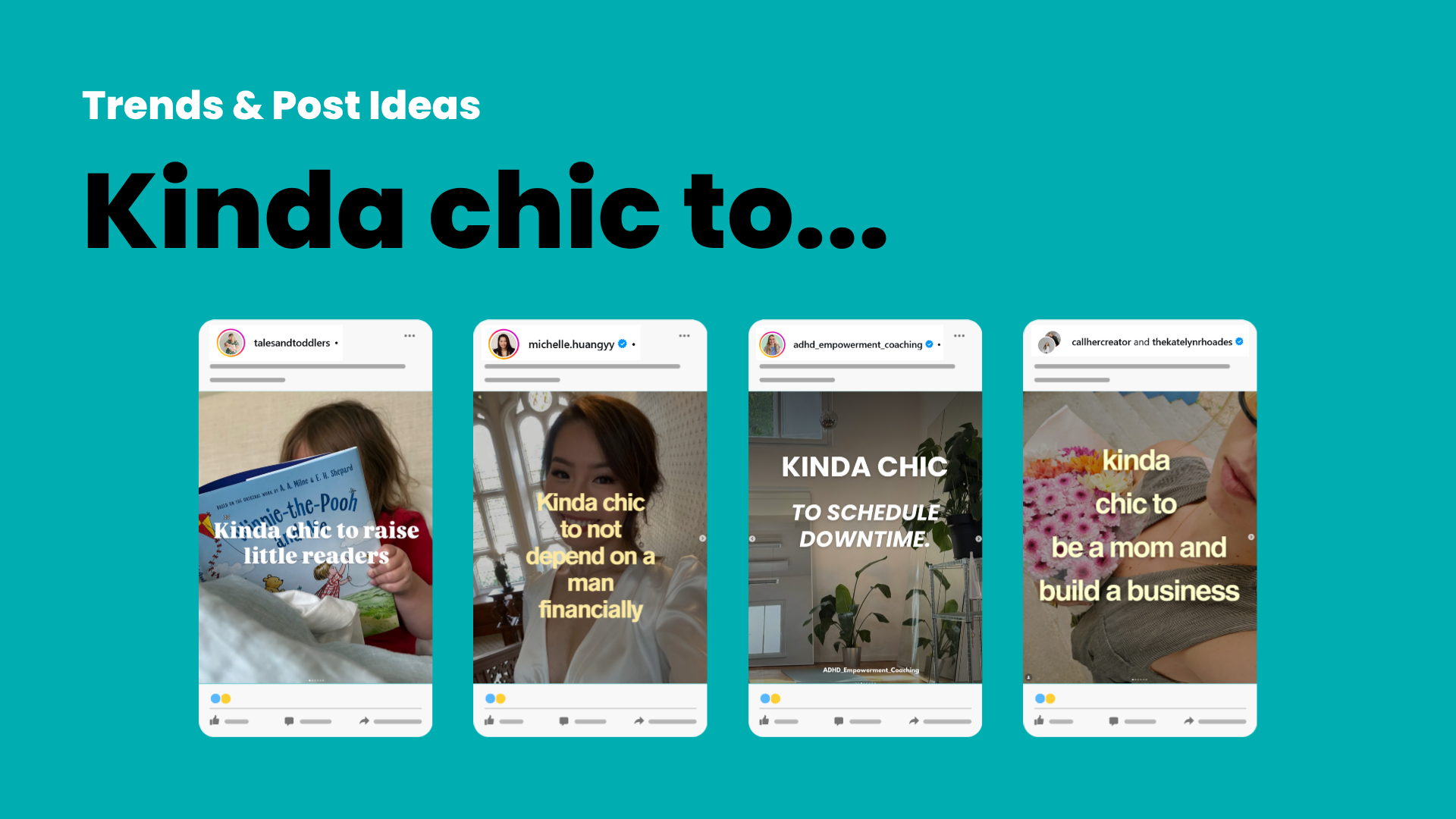
Trend watch: "kinda chic to..."
You've probably seen this one. A carousel or post built around "kinda chic to [do the thing]."
Tales and Toddlers used "kinda chic to raise little readers," then walked through the benefits of reading for kids. Michelle Huang in the financial advice space used "kinda chic to not depend on a man financially." Dr. Janina, an ADHD-focused account ran a whole carousel of variations, "kinda chic to schedule down time," "kinda chic to listen to your brain," "kinda chic to stop beating yourself up," across five or six slides. There was even a collab post with Call Her Creator and Katelyn Rhoades using "kinda chic to be a mum and build a business," tagged so it landed on both creators' grids.
It works because it's curiosity-driven. People want to see how the next account fills in the template. You don't have to use the word "chic" either, one creator swapped it for "punk" to better match her audience, and called it out directly in the caption: everybody's doing "kinda chic to," but she's never been chic in her life. Still used the trend, made it hers.
Get stupidly specific with your hooks
This one's not new, but it's working harder than ever right now. Generic hooks get generic results.
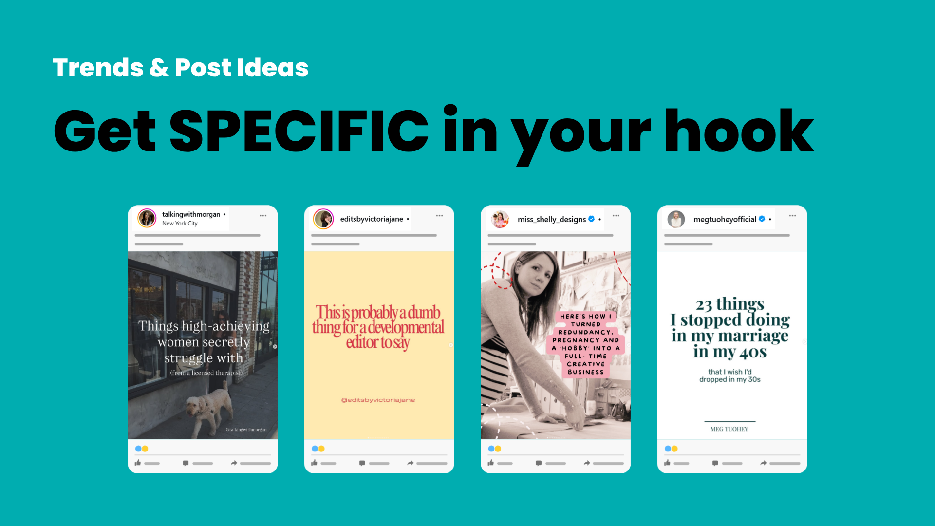
"Things high-achieving women struggle with" is fine. "Things high-achieving women secretly struggle with, from a licensed therapist" makes you sit up, because now it feels like she actually gets under the hood of who she's talking to. A developmental editor didn't post "dumb things editors say," she posted "probably a dumb thing for a developmental editor to say," which signals a different level of expertise to the exact people who need her. Miss Shelly Designs didn't say "how I turned my hobby into a business," she said "how I turned redundancy, pregnancy and a hobby into a full-time creative business," which pulls in anyone who resonates with any part of that story, not just the outcome.
Then there's "23 things I stopped doing in my marriage in my 40s that I wish I'd dropped in my 30s." Specific number, specific decade, and it calls out two different audiences at once, the 40-somethings thinking "better fix this," and the 30-somethings thinking "good to know before I get there."
Broad hooks feel safer because you think you're catching more people. In practice, specificity is what makes someone feel like you actually get them, and that's what gets the tap, the read, the share. If you're worried about leaving other people out, make them a different post in a couple of weeks. You don't have to catch everyone in one go.
The buttery yellow of it all
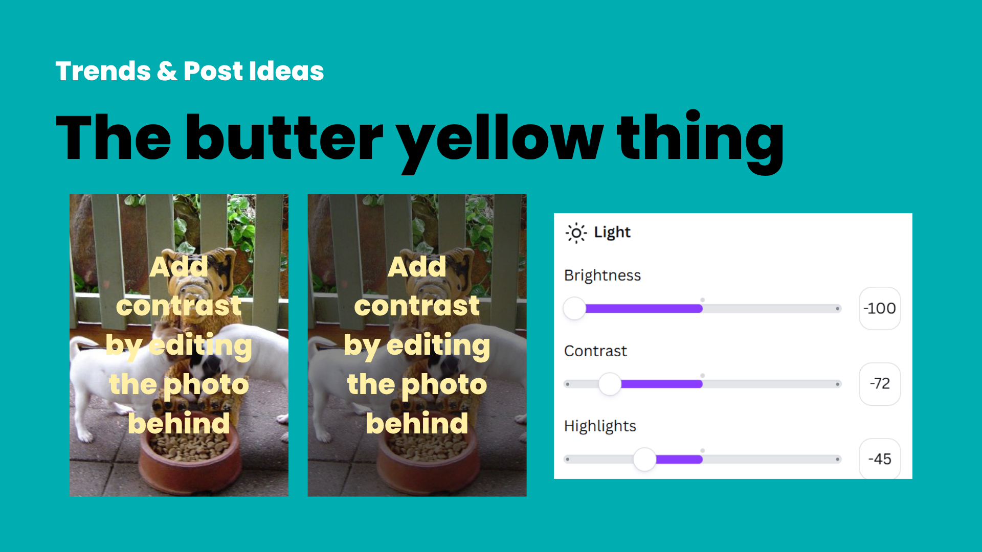
That soft, pale yellow that's everywhere at the moment, some people love it, some can't stand it, some haven't even clocked it until it's pointed out. Either way, it's trending hard, and there's a right way to use it.
You can't just slap the popular colour over a photo and call it done. You still need contrast, or nobody's reading your text. If I have to squint, zoom in, or tilt my head to read a graphic, I'm scrolling straight past, no second look. The fix isn't changing the text colour, it's editing the image behind it: drop the brightness, drop the contrast, drop the highlights, until the text is instantly legible without any effort.
If yellow's not your thing, the same principle works with other soft pastels, a pale violet, a muted coral, over a slightly desaturated photo. The trend itself isn't the problem. Skipping the basics of design while chasing it is.
That's the round-up. None of it's revolutionary on its own, but a few small tweaks (handwrite something this week, tighten up a hook, check your contrast before you post) go a long way.
Latest social media updates, including new LinkedIn AI controls and Instagram grid features to refine your profile.
Hi, I'm Anastasia,
I love creating things. Especially things that can help small business owners make their day a tiny bit easier.
I, myself, am a bad business owner 😆 I spend time to create things, give them away, then wonder why this business thing doesn't pay the bills.
So, rather than me taking hours, struggling to put prices on some of the awesome things I create, I'll leave it up to you. If you found something I made, wrote or recorded useful, entertaining, or you're just feeling friendly... buy me a coffee.
